


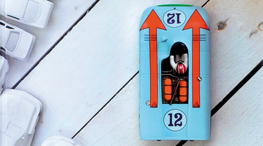
“In the 70s they called it war paint,” says author Sven Voelker, at the start of the intriguing video interview about his new book. But do watch the video as it’s far more than an interview. Even if you’re not interested in graphic design and racing car livery, it doesn’t matter – just enjoy the plentiful period footage of the more dramatically decorated cars which the author uses to illustrate his points.
“These cars were designed to look dangerous; they were designed to look like the winner,” he says, showing great enthusiasm for the ‘complete anarchy’ and ‘randomness’ of the liveries they came up with in the 1970s, when there were “very few sponsors but very strong designs”.
The designs, claims Voelker, “make these cars visually faster. They don’t make them faster, but they look faster”.
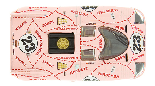
And indeed, 40 years later, it is often the advertising messages that we remember most vividly, rather than the cars, the drivers and the race results. This book will stir emotional memories of Marlboro Ferrari and Gulf Porsche – and the more bizarre examples, too.
“Everything was flower power – and these cars were flower power too,” claims Voelker. “These cars are not ‘well-designed’… but they are just so cool.”
For more information on Go Faster: The Graphic Design of Racing Cars by Sven Voelker, see www.svenvoelker.com.


Photos: Gestalten Verlag
ClassicInside - The Classic Driver Newsletter
Free Subscription!